ITHRIVE — coaching platform rebrand
ITHRIVE is a virtual coaching academy built around a simple premise: every individual has unique talents worth developing. The founder wanted a brand identity distinctive enough to stand out in a crowded coaching market, and a website that translated that identity into an experience people would trust with their personal development.
Logo concept
The client came in with two symbols in mind — an owl (knowledge, introspection) and an eagle (vision, strategic foresight). Rather than choosing one, I combined both into a single logomark, unifying two meanings into one coherent brand story rather than diluting the identity across two competing symbols.
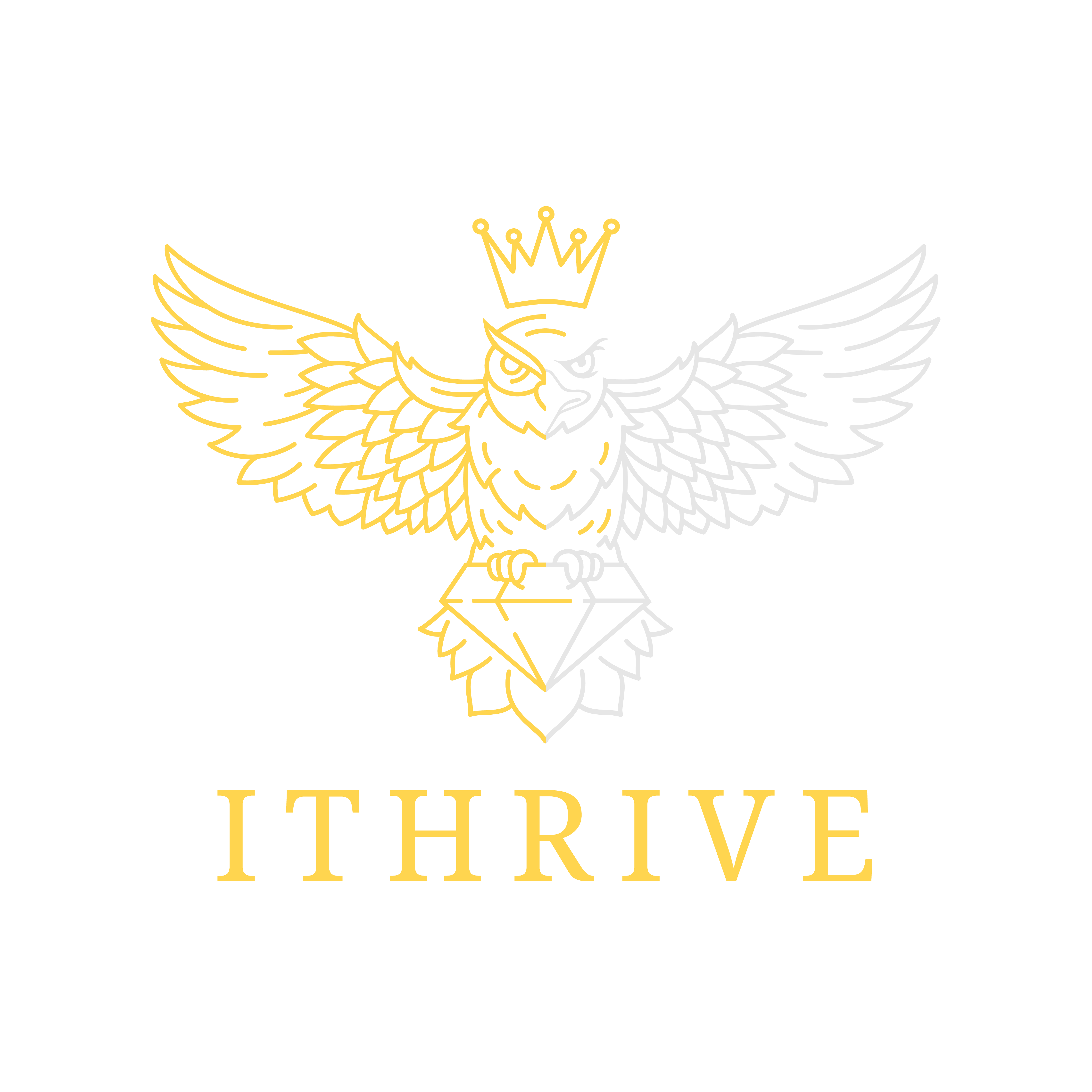
Every symbolic element was chosen to mean something specific, not just to look impressive: owl for knowledge, eagle for vision, crown for accomplishment, diamond for inner potential.
Colour & typeface
Warm gold represents clarity and optimism; neutral greys ground the palette in formality and trust. Noto Serif carries headings and formal communications with a professional, established feel, while Poppins handles the web interface — simple, friendly and highly legible across devices.
From logo to full brand system
The identity extended across business cards, letterhead and email signature, then into a full responsive website: a homepage built around the founder's own voice and credentials, service pages, and a clear path to booking a session — all designed mobile-first so the experience held up identically on a phone as on a laptop.
"Ms. Thakur timely delivered on the design aspects for the overall website, brand, and always brought unique ideas to the table. She has proven to be a most reliable, creative, detail-oriented and professional web designer."
— Vikas Poni, Founder & Chief Coaching Officer, ITHRIVEShribalaji Integrated Solutions — industrial rebrand
Shribalaji had operated for over 25 years in industrial welding supply, but its existing logo felt dated and had been sourced from a generic online template — a real liability for a company seeking formal trademark protection. The challenge: modernise the identity while keeping the cultural and religious meaning behind the brand name intact for the family that built it.
Logo concept — tradition meeting modern craft
The brand name comes from "Shri Balaji," a name rooted in personal religious faith. Rather than treating that as a limitation for a global audience, I treated it as the brand's most distinctive asset: I designed a torchbearer logomark — a figure that leads and inspires — built around a stylised rendering of the Hindi character for "Shri," blended with a flame motif symbolic of welding itself.
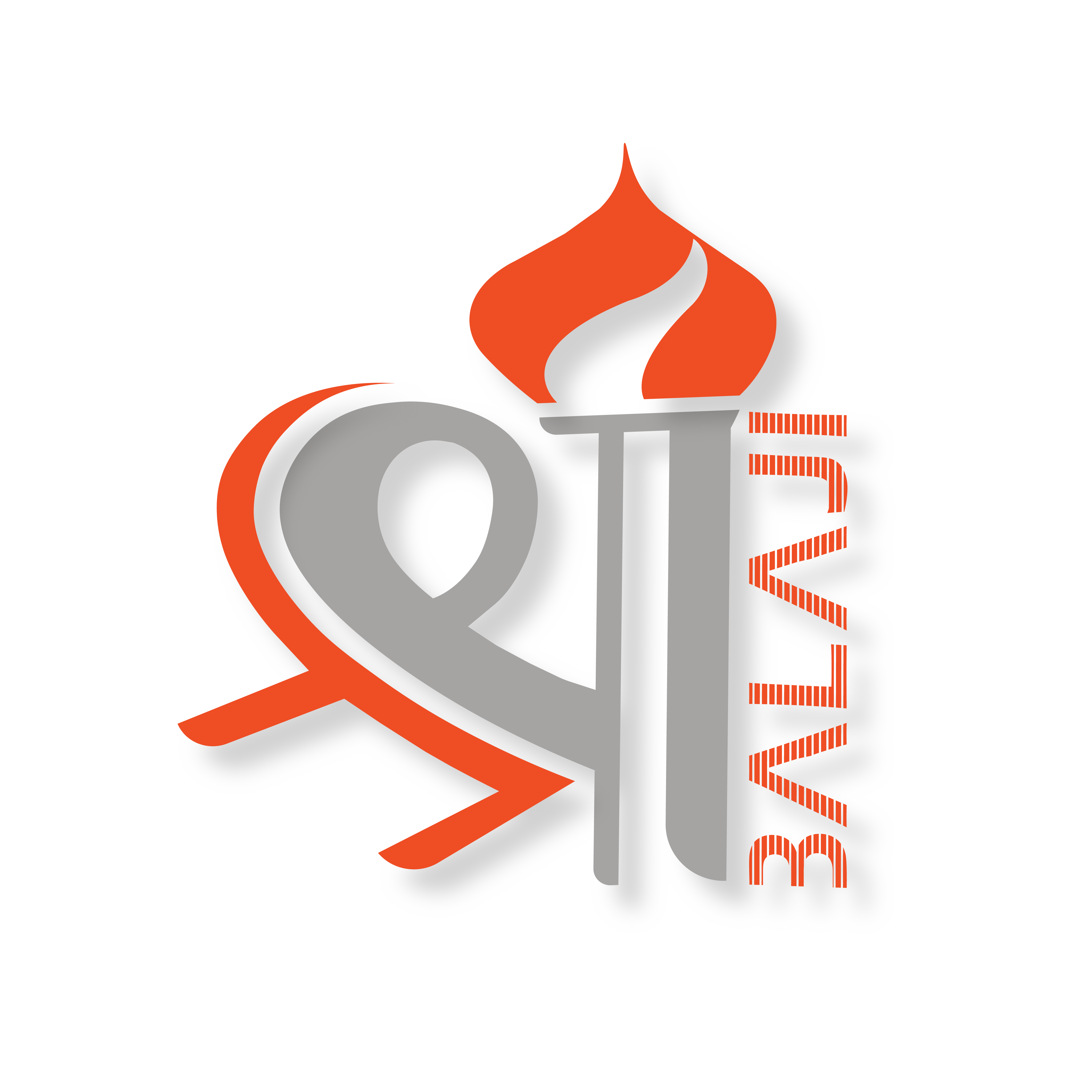
A modern logomark that keeps the brand's traditional meaning legible rather than erasing it for the sake of "looking global": the flame for welding and energy, the torchbearer form for leadership.
Colour, type & collateral
A vivid flame orange paired with a strong iron grey signals both energy and industrial credibility. Copperplate Gothic Bold carries the wordmark with a confident, contemporary edge while staying legible at small sizes on business cards and invoices. The full identity rolled out across letterhead, business cards, commercial and A4 envelopes and email signatures — every touchpoint the client used day to day.
A content-constrained website
The client needed a professional web presence but wanted to keep public information deliberately limited for confidentiality reasons. I designed a mobile-first, information-oriented microsite — Home, About, Products, Contact — that felt complete and trustworthy within those real constraints, rather than padding it out with filler content.
"[Mallika] has proven to be very creative and talented in her design work. She is a good communicator and a listener who comprehends the requirement of a work in less time. Her flexible approach and her ability to bring in new ideas makes her work more creative, unique and distinguished."
— Shakun Bansal, Director, Shribalaji Integrated SolutionsReflection
Both projects reinforced the same lesson from opposite directions: a strong brand identity has to mean something specific to the people behind it, not just look good in isolation. Whether that meaning came from combining two symbolic animals or preserving a name rooted in religious faith, the job was translating something personal into something a wider audience could trust at a glance — the same instinct I now bring to translating stakeholder intent into interfaces.
Want the full research, wireframes, storyboards and prototype video for this project?